
UB Consulting: Resilient Salmon - Will Demand Hold Into 2023?
Monday, 16 January 2023January 16, 2023
There is no doubt that there has been a salmon frenzy in the U.S. for at least the last 10 years. Some years are better than others, but consumption keeps increasing while real prices have also increased. Naturally, all these are a function of production—availability—and while there have been several shocks to the market along the way, price spikes have not deterred overall demand. We can illustrate such a statement in numerous ways, such as net supply through Atlantic salmon imports—both fresh and frozen—over time, and wholesale and retail prices in nominal and real terms, among others.
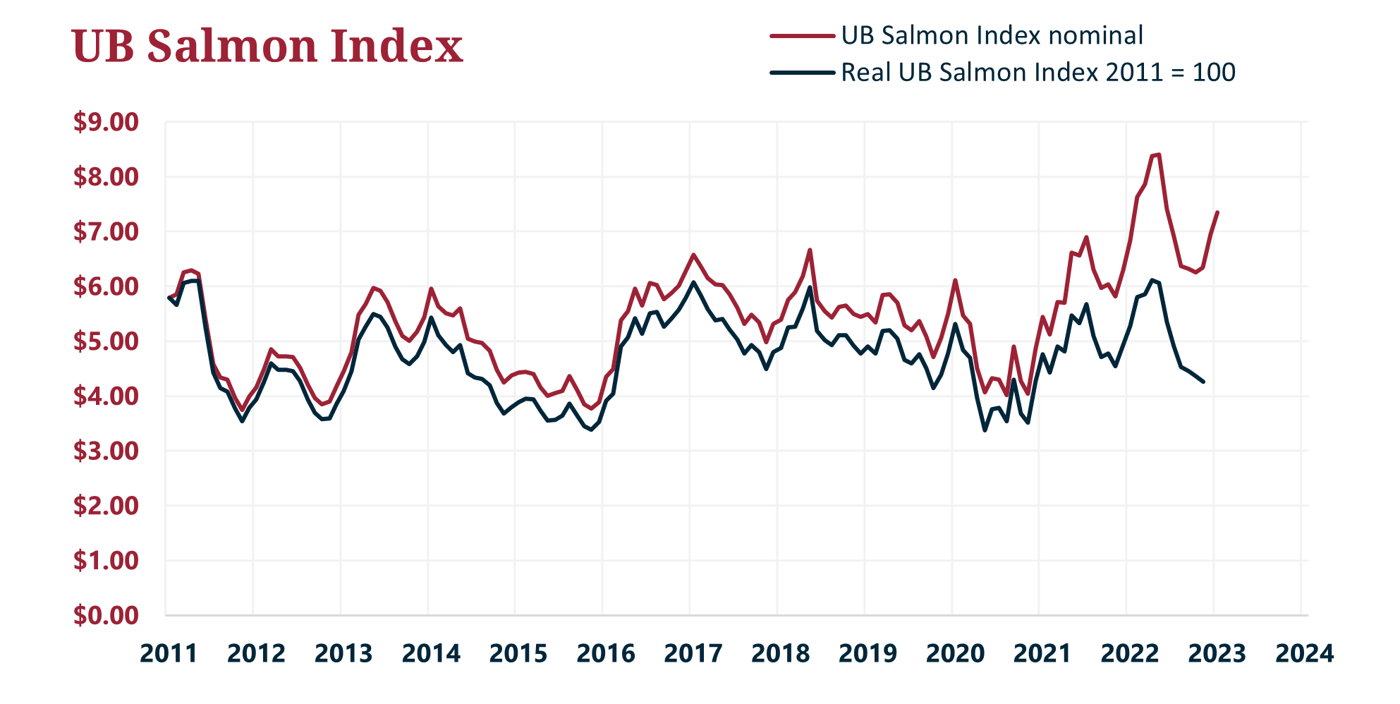
Chart 1: UB Fresh Atlantic salmon index in nominal and real dollars.
First, we created an Atlantic salmon demand index—still in its beta form—that measures price elasticity at the wholesale level relative to an indicator of consumption per capita. This index adjusts for inflation and population growth. As we can notice, the index has trended higher over time considerably. This model suggests that aside from availability, demand for salmon has expanded significantly sometime in Q2 2016. As you can see in the chart below, above 100 means demand expansion.
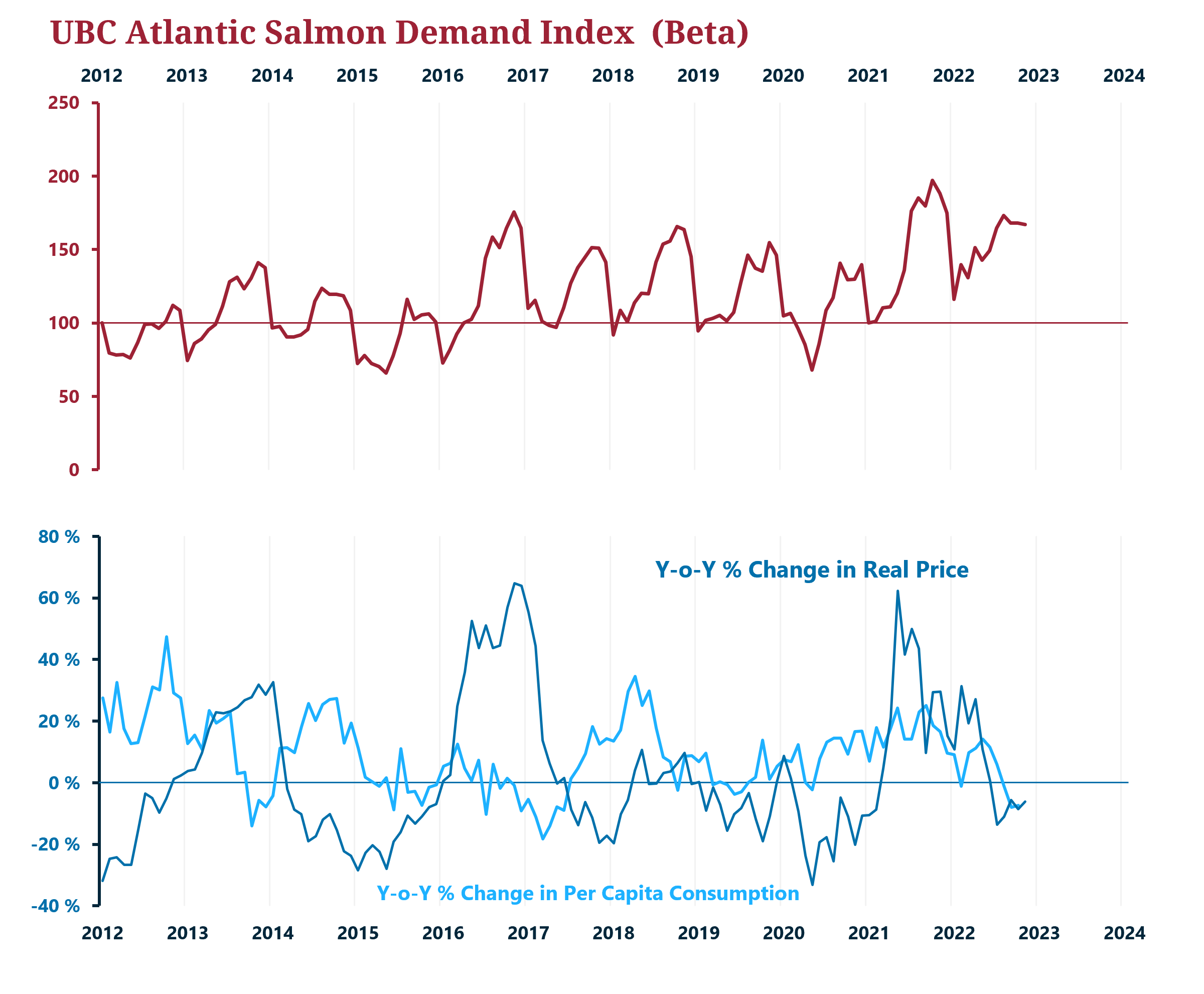
Chart 2: UBC Atlantic Salmon Demand index (beta) and year-over-year changes in per capita consumption (UBC estimated) and real prices for fresh Atlantic salmon at the wholesale level (UB quotation).
We also created an index that weighs and adjusts Google Trends for salmon over time. This index combines several combinations of words in addition to “salmon,” such as “farm-raised salmon.” This index is much simpler but also suggests more interest in salmon over time.
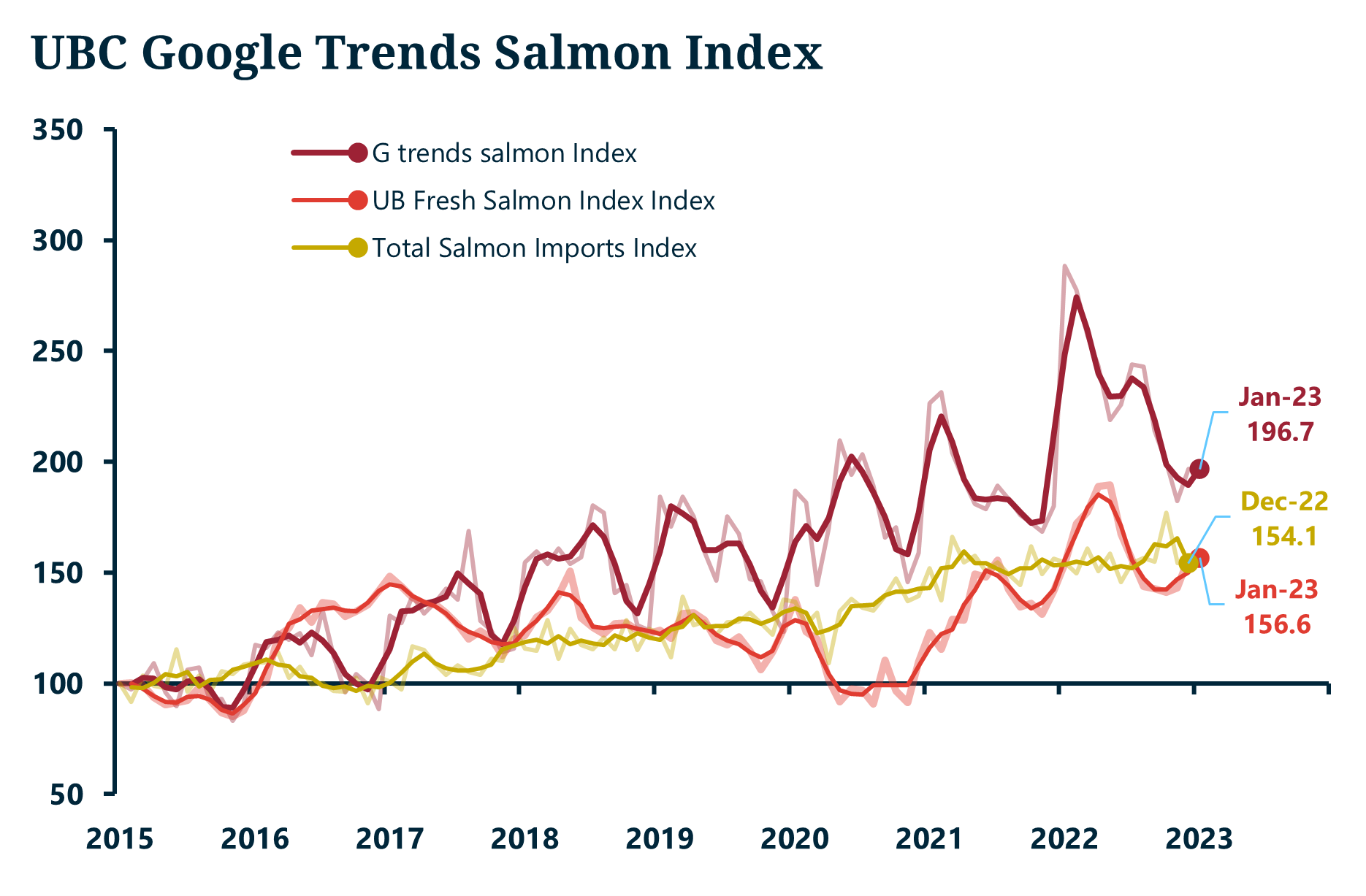
Chart 3: UBC Google trends salmon index (beta), Atlantic salmon imports (fresh and frozen), and UB fresh Atlantic salmon index (nominal), as an index. 2015 = 100.
What is interesting about this indicator is that, when measured with imports, the correlation between these two is relatively high when lagging imports by three months. In other words, if our Google Trends index is an indicator of salmon demand, imports tend to go in the same direction between 2-3 months later.
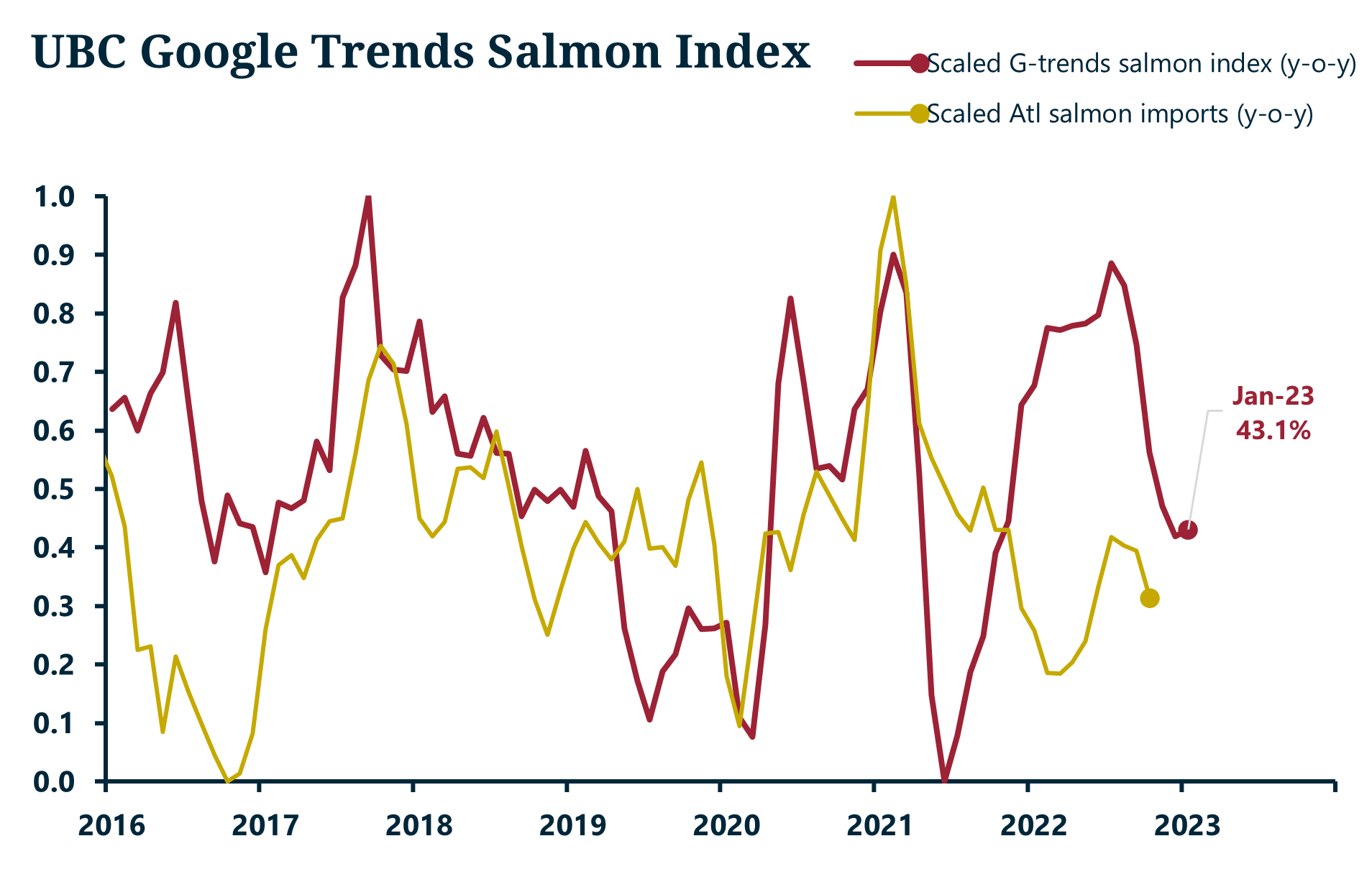
Chart 4: Transformed and lagged year-over-year change for UBC Google trends salmon index (beta) and Atlantic salmon imports.
So, now that we have established that demand and volume have found their equilibrium over time—meaning, supply, and demand, in real terms, have kept up with each other with somewhat of a lag—we can conclude that despite higher prices, demand has remained strong.
However, this has not happened without hiccups. Fundamentals suggest that the more production there is, prices would trend lower for a particular time observed. But there have been breaks where the relationship has been opposite, in which imports and prices move higher. We illustrate such structural breaks in nominal prices below.
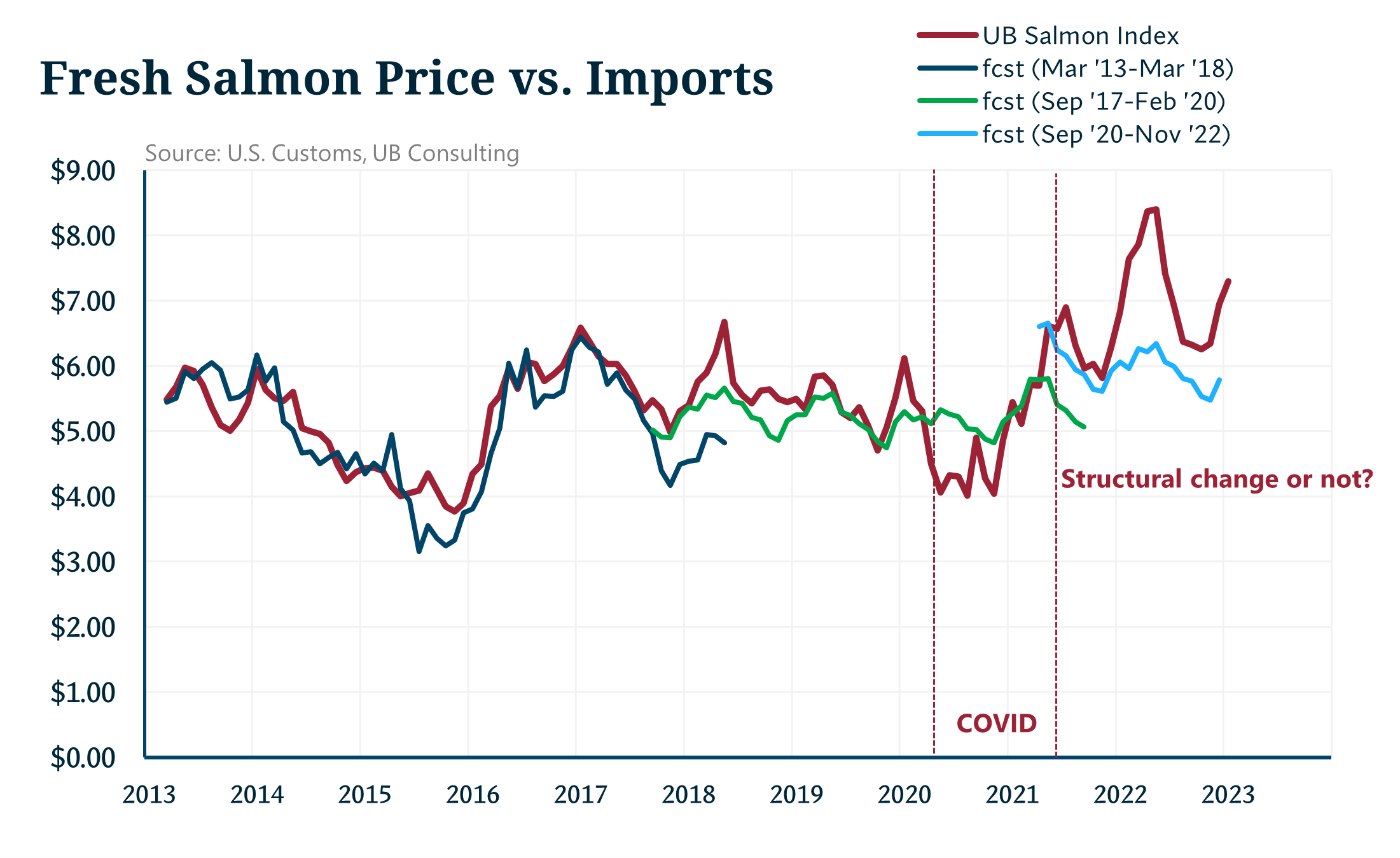
Chart 5: Different price models for UB’s fresh Atlantic salmon index using Atlantic salmon imports and identifying structural price breaks over time.
After looking at these levels and breaking them further to adjust for shocks to the market, we can see that supply and demand are not always downward-sloped—in other words, the relationship between these two is negative.
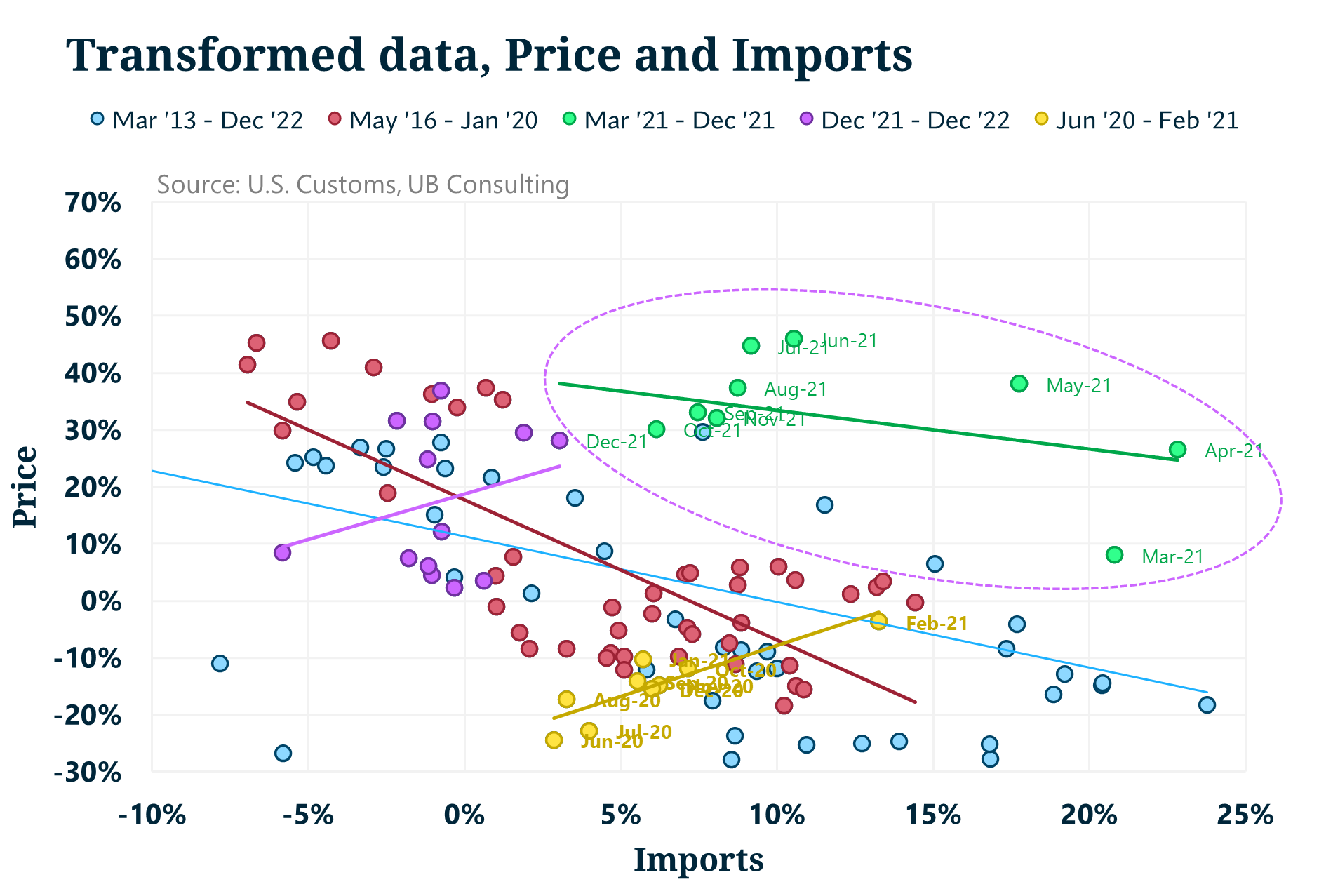
Chart 6: Linear relationship between non-seasonally adjusted imports and price over time.
But the fundamental structural change happened around 2018, with sporadic shocks to the market in 2016 and beyond. While some of these breaks can be arbitrary—like the chart above—the chart below illustrates more clearly when these breaks have occurred.
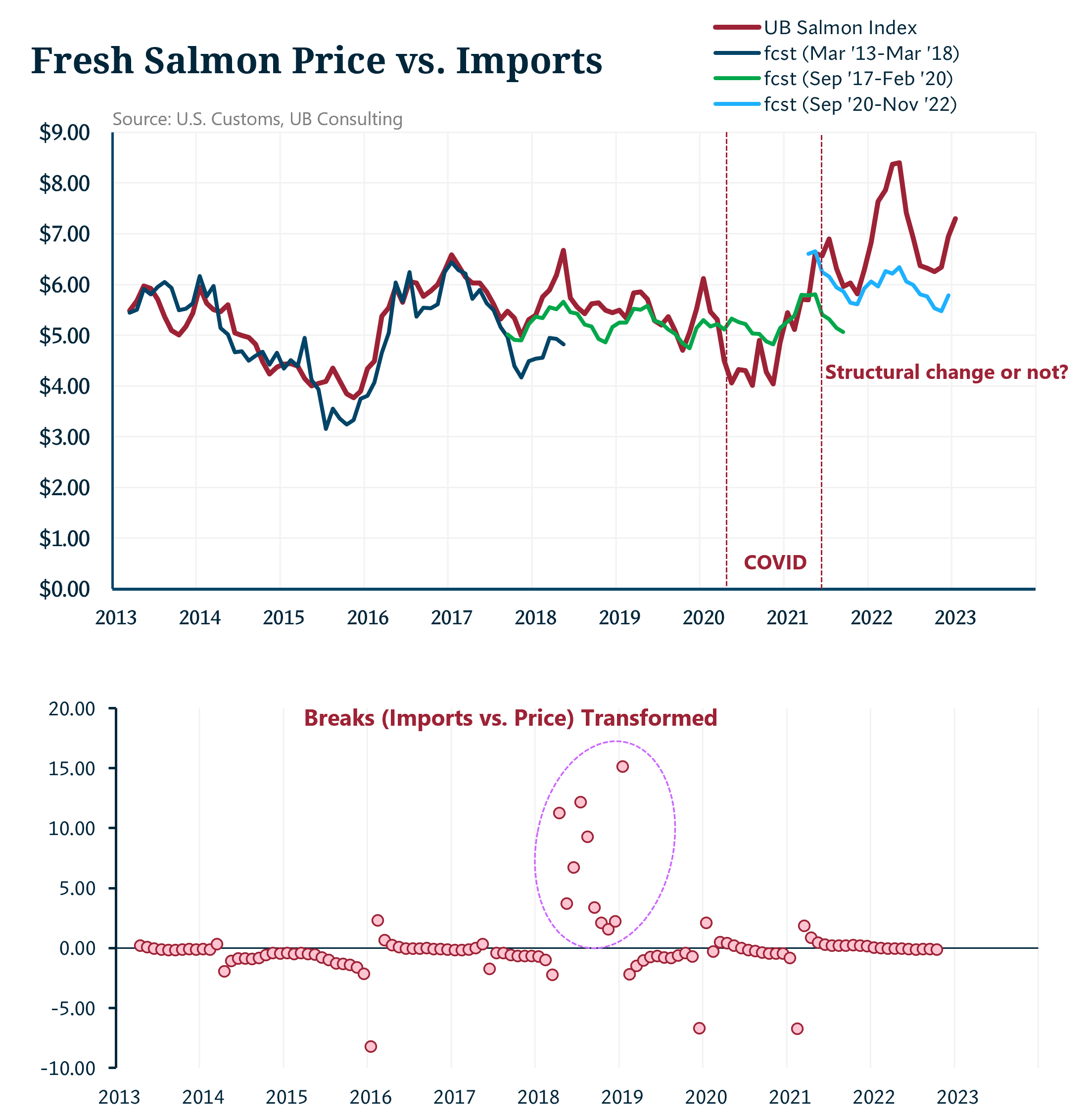
Chart 7: Previously shown model and breaks in imports and price relationships. 2018 marks a noticeable change in these relationships in the scatter plot (bottom chart) and green line (top chart).
The question moving ahead is straightforward. Will salmon demand remain strong given the inflationary environment in the economy and the prospects of an eventual recession? For now, the quick models we performed suggest two things. If demand contracts somewhat due to a price, it is still likely that we can see overall nominal prices sit at higher thresholds. In other words, we would return to the price level thresholds seen before the price spike in 2022. So, if we consider 2022 to be an outlier, there is a potential to return to previous price thresholds.
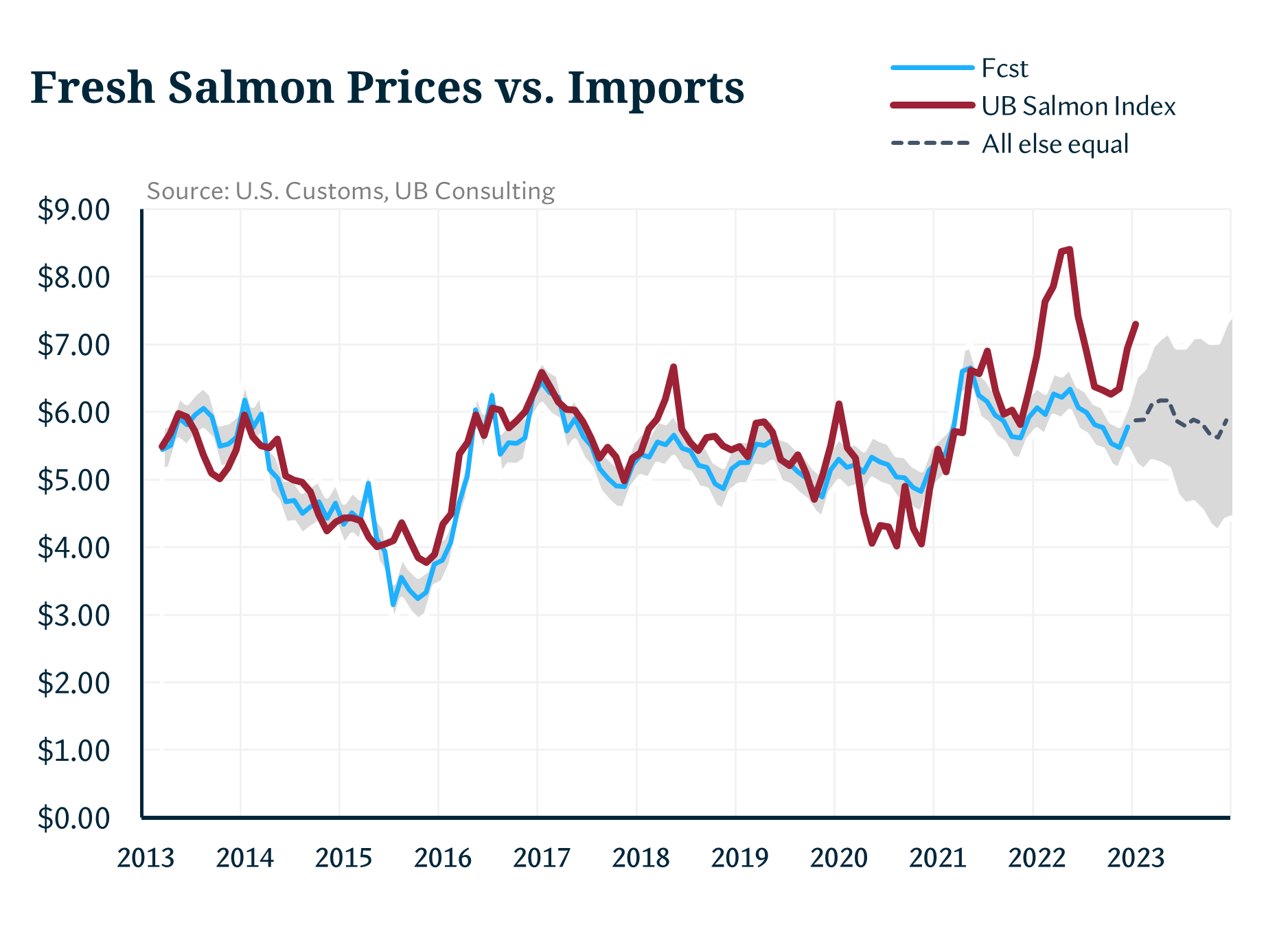
Chart 8: UBC’s price model assuming a structural break in 2021, and prices returning to those levels in 2023, “all else equal”.
But salmon demand has remained resilient for a long time despite higher real prices. This time, the market will test whether current prices are sustainable in the long run.

Chart 9: UBC’s price model assuming another structural break into 2023.
Note: UB salmon index only weighs fresh salmon prices at the wholesale level. Forecasts and models were developed in nominal dollars.
Photo Credit: Food Impressions / Shutterstock.com
Andrei Rjedkin
Urner Barry
1-732-240-5330 ext 293
arjedkin@urnerbarry.com
Angel Rubio
Urner Barry
1-732-240-5330
arubio@urnerbarry.com